

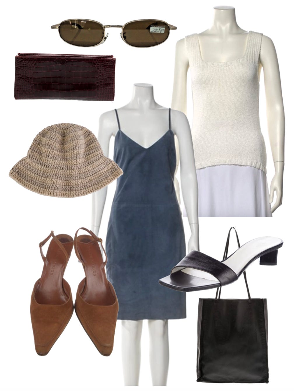
Romantic Blues
& blush kissed hues - Spring forward

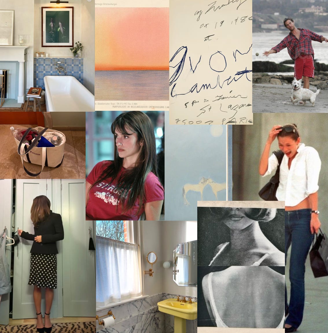
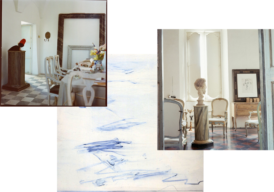
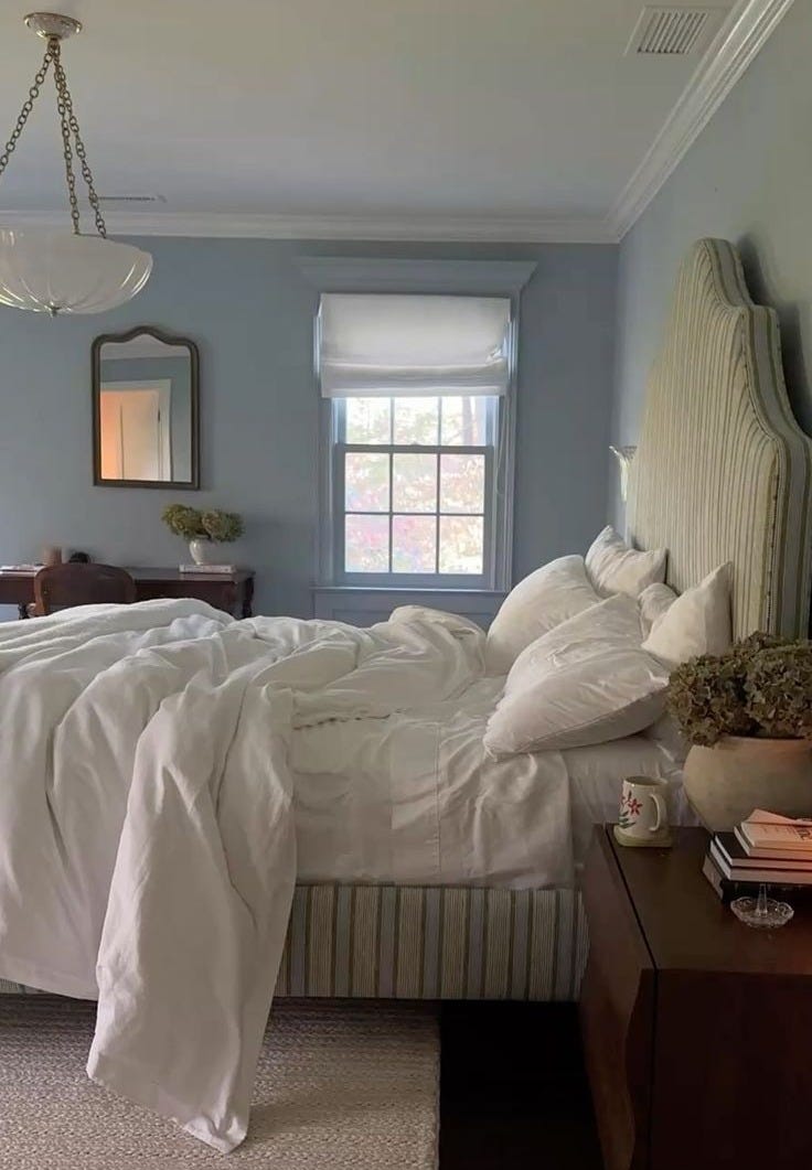
I’ve been noticing how drawn I am to dusty pale blues lately - mostly in interiors, on walls, in ceramics and upholstery - a colour that feels calm but still gives a room dimension.
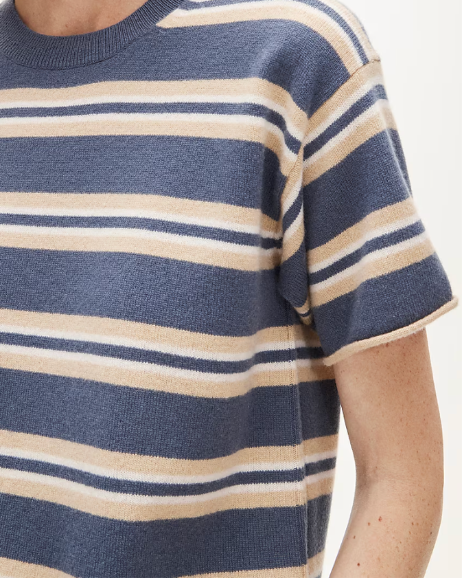
It made me think about how well that same tone works in a wardrobe at this time of year. Pale blue keeps things interesting while still feeling effortless, especially paired with blush-kissed hues or subtle spring-forward hints of red. There’s something about soft, warm shades layered together that makes a look feel natural, undone, and easy to wear.
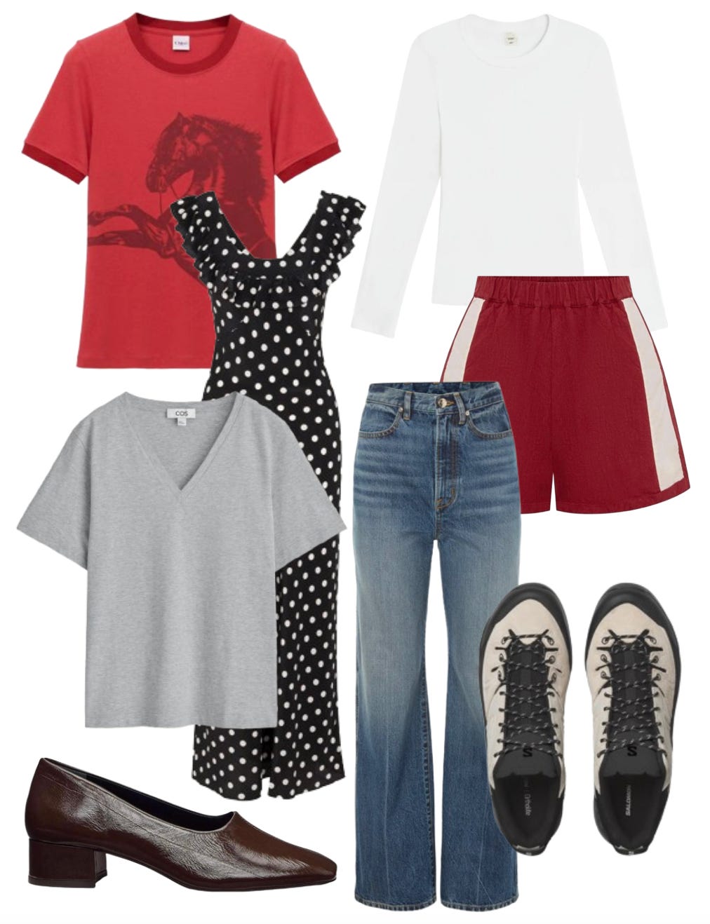
For anyone looking to add something new for spring, here are a few pieces I’ve been loving that capture this palette and feel.
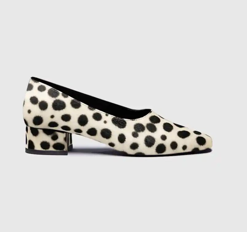
Reformation has rolled out some great new pieces (as they always do). For any CBK fans out there, myself very much included, they’ve just released these heeled, square-toe pumps which would work perfectly with a white shirt and jeans. Make sure you're signed up to be notified when they launch.
Another brand that has launched a new exciting product is Westman Atelier, with their Hydrobalm. Westman Atelier has always been good at that low maintenance, polished-but-undone aesthetic, where skin still looks like skin, just fresher, and this does exactly that.
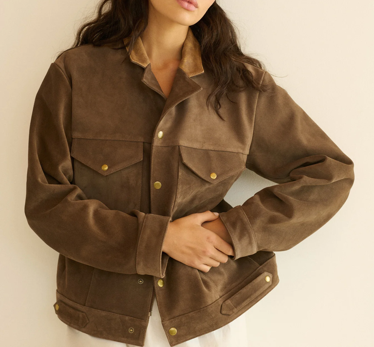
Speaking of suede, Saie’s new Supersuede Baked Bronzer has been getting a lot of attention. I saw it advertised as “the most effortless, natural-looking powder bronzer you’ve ever tried, simply melting into the skin,” and if it really does all that, it’ll definitely be worth trying.
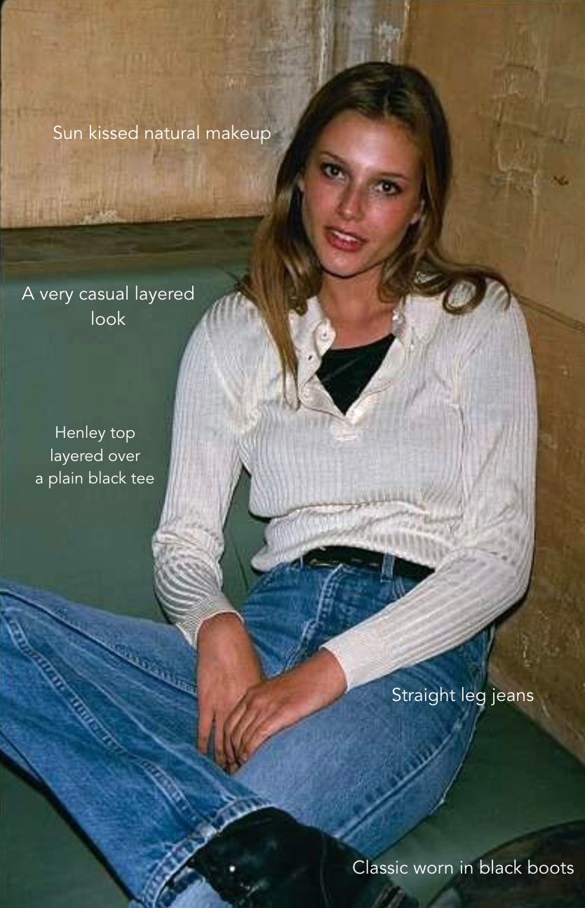
This Week’s Inspo Look
That’s all for now!
xx
Olivia
this is so so pretty